

Note
Go to the end to download the full example code or to run this example in your browser via Binder.
Binning#
Binning is a technique used to group continuous values into a smaller number of bins. This is particularly useful when you have irregularly distributed data and want to analyze it on a regular grid. In this example, we will use pyinterp’s 2D binning functionality to calculate drifter velocity statistics in the Black Sea over a 9-year period.
import cartopy.crs
import matplotlib.pyplot
import numpy

import pyinterp
import pyinterp.tests
Loading the Data#
First, we load the drifter data, which includes longitude, latitude, and velocity components (u and v).
ds = pyinterp.tests.load_aoml()
We then calculate the velocity magnitude from the u and v components.
Defining the Grid#
Next, we define the 2D grid on which we will bin the data. The grid is defined by two axes: one for longitude and one for latitude.
binning = pyinterp.Binning2D(
    pyinterp.Axis(numpy.arange(27, 42, 0.3, dtype=numpy.float64),
                  period=360.0,),
    pyinterp.Axis(numpy.arange(40, 47, 0.3, dtype=numpy.float64)))
print(binning)
<pyinterp.core.Binning2DFloat64 object at 0x11d61b9b0>
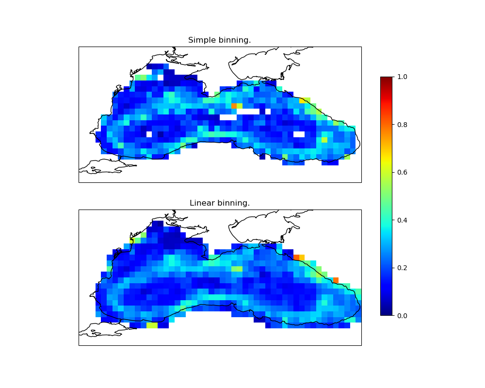
Simple Binning#
With simple binning, each data point is assigned to the bin that contains its coordinates. We push the data into the bins and then compute the mean of the values in each bin.
binning.clear()
binning.push(ds.lon.values, ds.lat.values, norm.values, True)
simple_mean = binning.mean()
Note
For datasets larger than the available RAM, you can use Dask for parallel
computation. The push_delayed
method returns a Dask graph, which can be computed to get the result.
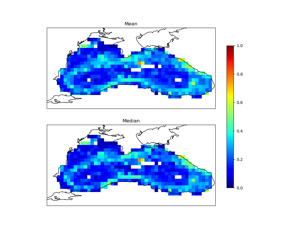
You can also compute other statistical variables like variance, minimum, and
maximum using the variable method.
Linear Binning#
Linear binning is a more advanced technique where each data point contributes to the four nearest bins, weighted by its distance to the center of each bin. This generally produces a smoother result.
binning.clear()
binning.push(ds.lon.values, ds.lat.values, norm.values, False)
linear_mean = binning.mean()
Visualizing the Results#
Finally, we visualize the results of both simple and linear binning.
fig = matplotlib.pyplot.figure(figsize=(10, 8))
fig.subplots_adjust(left=0.05, right=0.95, top=0.95, bottom=0.05, hspace=0.25)
ax1 = fig.add_subplot(211, projection=cartopy.crs.PlateCarree())
lon, lat = numpy.meshgrid(binning.x, binning.y, indexing='ij')
pcm = ax1.pcolormesh(lon,
                     lat,
                     simple_mean,
                     cmap='jet',
                     shading='auto',
                     vmin=0,
                     vmax=1,
                     transform=cartopy.crs.PlateCarree())
ax1.set_extent([27, 42, 40, 47], crs=cartopy.crs.PlateCarree())
ax1.coastlines()
ax1.set_title('Simple Binning')

ax2 = fig.add_subplot(212, projection=cartopy.crs.PlateCarree())
pcm = ax2.pcolormesh(lon,
                     lat,
                     linear_mean,
                     cmap='jet',
                     shading='auto',
                     vmin=0,
                     vmax=1,
                     transform=cartopy.crs.PlateCarree())
ax2.set_extent([27, 42, 40, 47], crs=cartopy.crs.PlateCarree())
ax2.coastlines()
ax2.set_title('Linear Binning')
fig.colorbar(pcm, ax=[ax1, ax2], shrink=0.8)
<matplotlib.colorbar.Colorbar object at 0x11df317f0>
Histogram2D#
The TDigest class is similar to the
Binning2D class, but it calculates the
histogram of the data in each bin instead of the statistics.
Let’s calculate the 2D histogram of the drifter data.
hist = pyinterp.Histogram2D(
    pyinterp.Axis(numpy.arange(27, 42, 0.3, dtype=numpy.float64),
                  period=360.0,),
    pyinterp.Axis(numpy.arange(40, 47, 0.3, dtype=numpy.float64)))
hist.push(ds.lon.values, ds.lat.values, norm.values)
We can then visualize the histogram.
fig = matplotlib.pyplot.figure(figsize=(10, 4))
fig.subplots_adjust(left=0.05, right=0.95, top=0.95, bottom=0.05, hspace=0.25)
ax1 = fig.add_subplot(111, projection=cartopy.crs.PlateCarree())
pcm = ax1.pcolormesh(lon,
                     lat,
                     hist.mean(),
                     cmap='jet',
                     shading='auto',
                     transform=cartopy.crs.PlateCarree())
ax1.set_extent([27, 42, 40, 47], crs=cartopy.crs.PlateCarree())
ax1.coastlines()
ax1.set_title('2D Histogram')
fig.colorbar(pcm, ax=ax1, shrink=0.8)
<matplotlib.colorbar.Colorbar object at 0x11d6016a0>
Total running time of the script: (0 minutes 1.832 seconds)