Using dataframes to explore data and make plots#
In this example we’ll see some ways to explore data that you can get from pygeodes and make plots
Imports#
[1]:
from pygeodes import Geodes
Configuration#
[2]:
geodes = Geodes()
Searching items#
Let’s start by searching recent items in Africa :
[3]:
from pygeodes.utils.datetime_utils import complete_datetime_from_str

date = complete_datetime_from_str("2024-07-20")

items, dataframe = geodes.search_items(
    query={
        "continent_code": {"eq": "AF"},
        "end_datetime": {"gte": date},
    },
    return_df=True,
    get_all=False,
)
/work/scratch/data/fournih/test_env/lib/python3.11/site-packages/urllib3/connectionpool.py:1099: InsecureRequestWarning: Unverified HTTPS request is being made to host 'geodes-portal.cnes.fr'. Adding certificate verification is strongly advised. See: https://urllib3.readthedocs.io/en/latest/advanced-usage.html#tls-warnings
  warnings.warn(
Found 361266 items matching your query, returning 80 as get_all parameter is set to False
80 item(s) found for query : {'continent_code': {'eq': 'AF'}, 'end_datetime': {'gte': '2024-07-20T00:00:00.000000Z'}}
Let’s add to our result dataframe the column eo:cloud_cover :
[4]:
from pygeodes.utils.formatting import format_items

dataframe = format_items(dataframe, {"eo:cloud_cover"})
Exploring data and adding colors in function of a parameter#
With numerical data#
Now we can explore our data on a map and add colors corresponding to cloud cover :
[5]:
dataframe.explore(column="eo:cloud_cover", cmap="Blues")
[5]:
Make this Notebook Trusted to load map: File -> Trust Notebook
With literal data#
It can also work with literal data, like processing:level :
[6]:
dataframe = format_items(dataframe, {"processing:level"})
[7]:
dataframe.explore(column="processing:level", cmap="Dark2")
[7]:
Make this Notebook Trusted to load map: File -> Trust Notebook
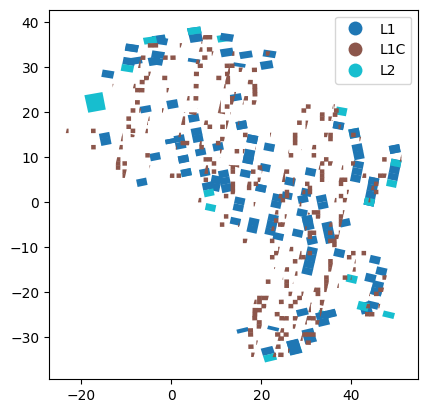
Plotting data#
You can also plot without the map canvas, for instance :
[8]:
import matplotlib.pyplot as plt

dataframe.plot(column="processing:level", legend=True)
[8]:
<Axes: >
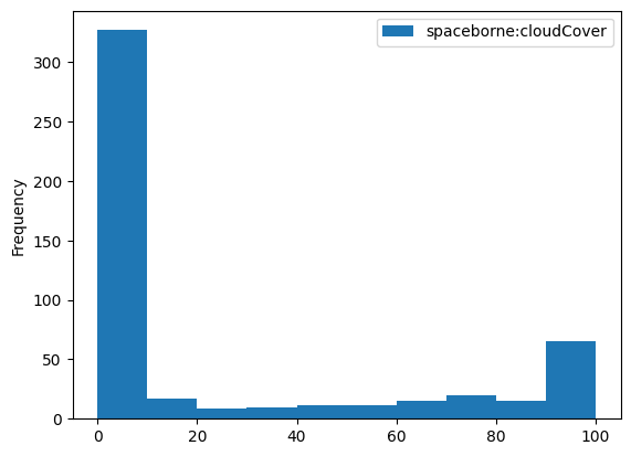
Or even plot without geometry, let’s see :
[9]:
dataframe.plot(kind="hist", column="eo:cloud_cover", range=(0, 100))
[9]:
<Axes: ylabel='Frequency'>
[ ]: